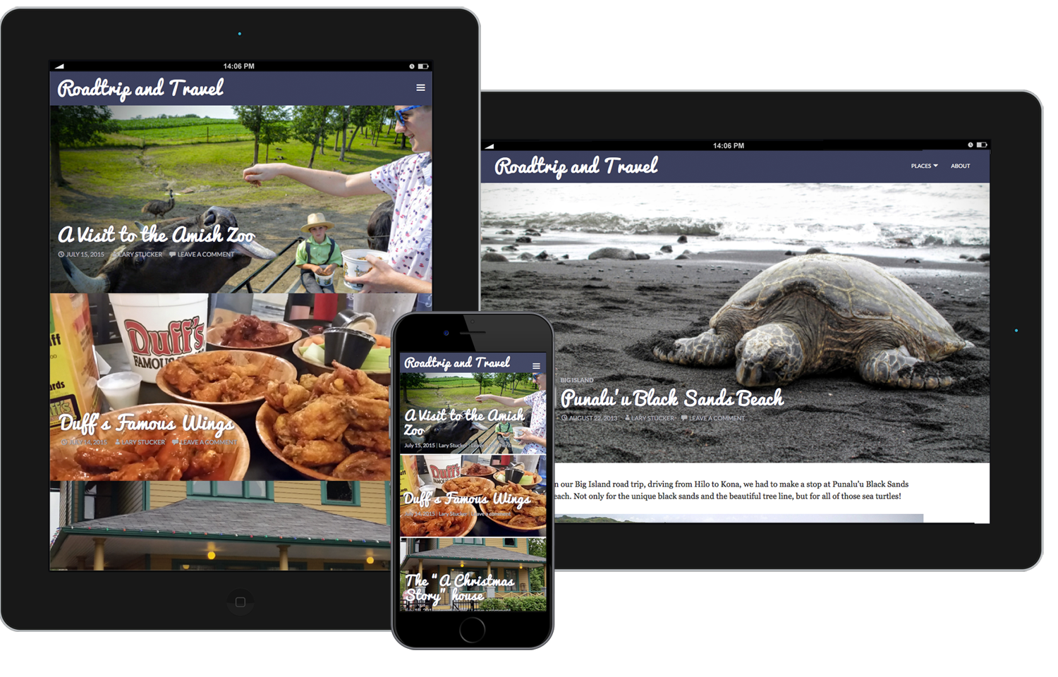
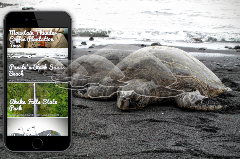
Capturing the wonder and adventure of travel in a mobile experience was a primary goal of the new travel bloggers site at Roadtripandtravel.com. FreshClicks designed and implemented an experience that displays large, beautiful images that send just the right size image to the device.
Built on WordPress
FreshClicks utilized the WordPress Engine to take advantage of the simple editor and media handling capabilities so that non-technical writers could spend their time writing great articles and not worrying about how to write code.
Custom Theme
Since image sizing by device was an important key to the success of this site, FreshClicks implemented a custom function to utilize the built-in capabilities of the the latest WordPress release.
Responsive Framework
Designing with a “mobile first” mind-set allowed us to create a rock-solid user experience that scales well on mobile, tablets, and desktop devices.
Faster servers
With the need for speed and ability to handle lots of concurrent visitors, FreshClicks recommended an NGINX server with Varnish to boost performance by more than 50%.